How to choose the right colour for your rebrand
Following our recent rebrand, our Creative Director, Danny, delves into the significance of colour associations and the crucial considerations for rebranding.
I’m feeling pretty blue today as I have been asked to write a piece on the psychology of colour. Hopefully, my views will leave you all feeling tickled pink, and make your competition green with envy. I suppose the point I am trying to make is we all associate colour with certain emotions, actions, and behaviours. But does the psychology of colour alone give us the tools to choose the right colour for your brand? We all know that colour is an incredibly powerful thing when used correctly, and the only real way to determine which colour or colours are right for your brand is to ask yourself the right questions.
What are your key objectives?
Do you want to build credibility and fit in? Or do you want to disrupt and stand out?
What do you want people to feel?
Should your audience feel reassured, inspired, energised, or calm?
Are you modern, established, premium, or exciting?
How accessible does it need to be?
As an agency we help businesses identify these questions, to deliver outcomes that not only capture their personality and values, but also deliver on their key objectives.
Here are some examples of where we have put this thinking into action:
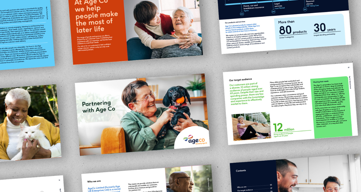
Age Co
Creating an age-positive brand for Age Co. Age Co is the commercial arm of Age UK, a charity that supports the country’s most vulnerable older people. The role of colour for Age Co is incredibly important in helping them to achieve their mission of creating a brand that is accessible whilst making their audience feel represented, delivering on their message of ‘making the most of later life’ the use of colour not only helped Age Co stand out from the crowd it also helped to create a clearer distinction between the charity (Age UK) and the brand.
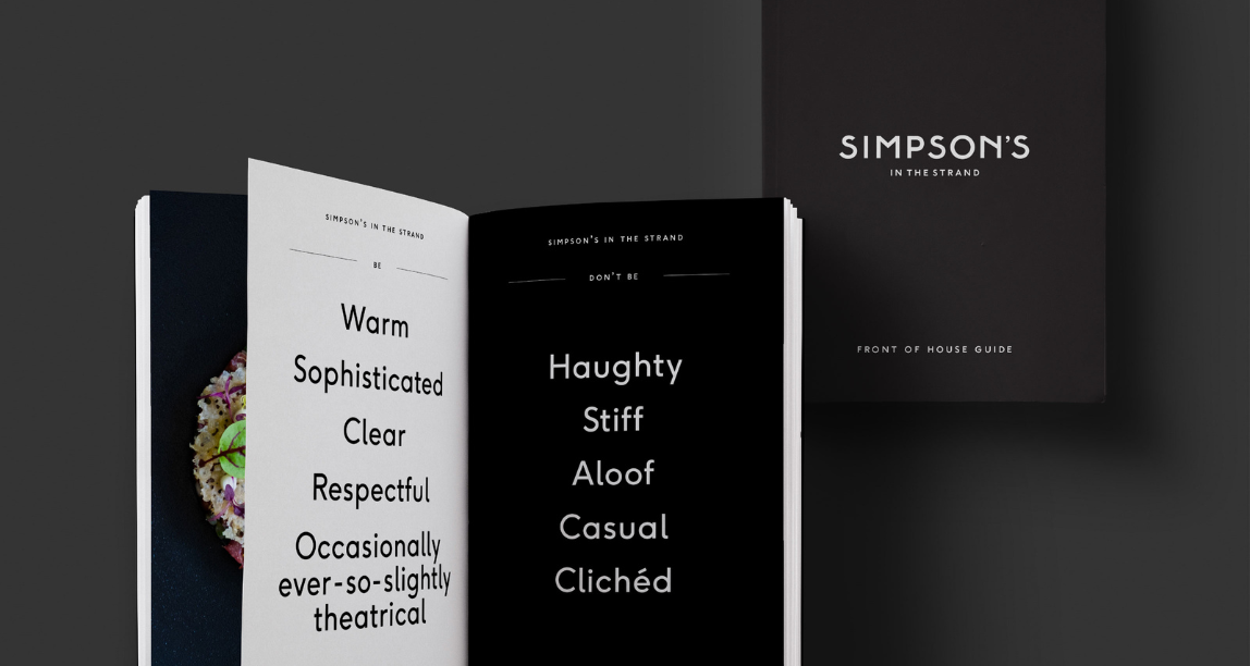
Simpson’s in the Strand
Serving up a brand refresh for Simpson’s. How do you reinvigorate a classic, ensuring it stays relevant, but without losing its unique heritage? Following their restoration and a reimagined menu, we worked with Simpson’s in the Strand to introduce their brand to a new generation and re-establish their reputation among growing competition as an essential London food destination. The key considerations for colour here were to create something that felt familiar and didn’t alienate their existing audience, whilst creating something fresh and premium. View case study
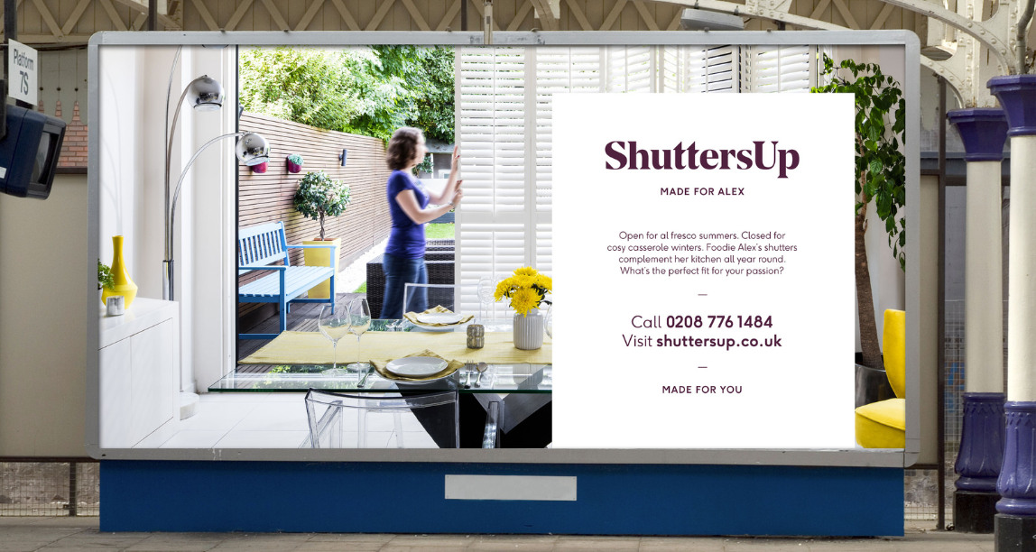
ShuttersUp
How does a small, founder-run business expand without losing the essence of what made it special in the first place? How do you ensure new staff fully embrace your unique culture and deliver to your exacting standards? How do you formalise an approach that up to now has been innate and instinctive? ShuttersUp needed a palette that would help them deliver on all of the questions above, the results were a palette that felt calm and reassuring, fresh and contemporary, but also a palette that helped them stand out from the crowd.
To find out more about what questions you should be asking yourself, send us an email or give us a call.