An age positive brand for Age Co
Age Co are the commercial arm of Age UK, a charity who support the country’s most vulnerable older people. Age Co’s relationship with the charity lends them credibility and trust, but the lines between the two organisations were blurred, leading to confusion for customers.
They asked for our help to create a distinct brand identity and purpose to resonate more with their target audience, while improving the transparency and clarity of the Age UK/Age Co relationship.

We first immersed ourselves in a piece of audience research commissioned by Age Co, to interpret the information into insights relevant to our challenge.
Alongside the research deep dive, we undertook our own cultural and social exploration, examining the trends and stereotypes of ageing.
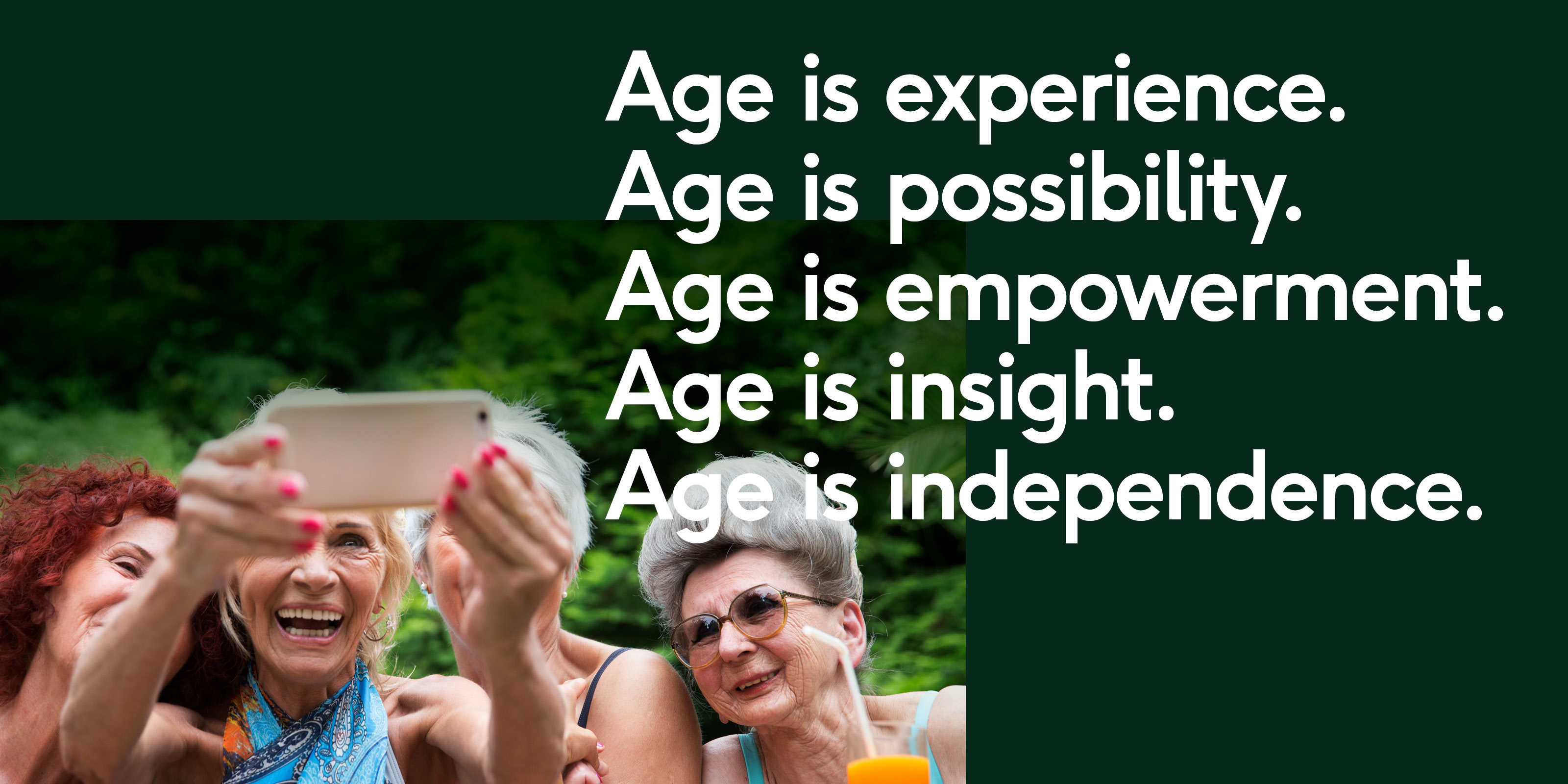
Analysis of the research and our own findings revealed a serious communications gulf: people in their later lives frequently feel misrepresented, misunderstood, patronised and even invisible.
Comparing our insights with Age Co’s core strengths and ways of working work, we came up with a platform; ‘age positive’, that would align the brand with their audiences’ needs.
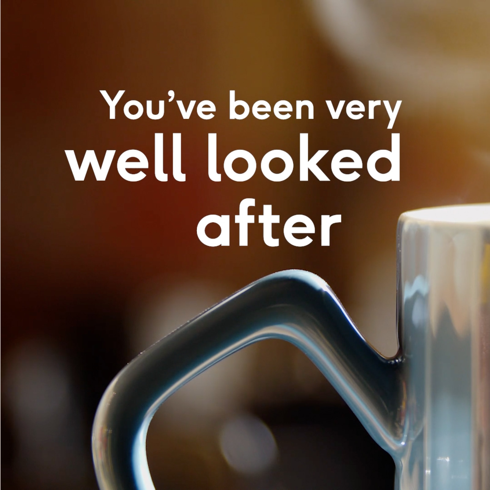
Our direction for creative was to redefine age as a lifetime of experience and an individual journey, one to be proud of and to be celebrated, rather than a burden to bear.
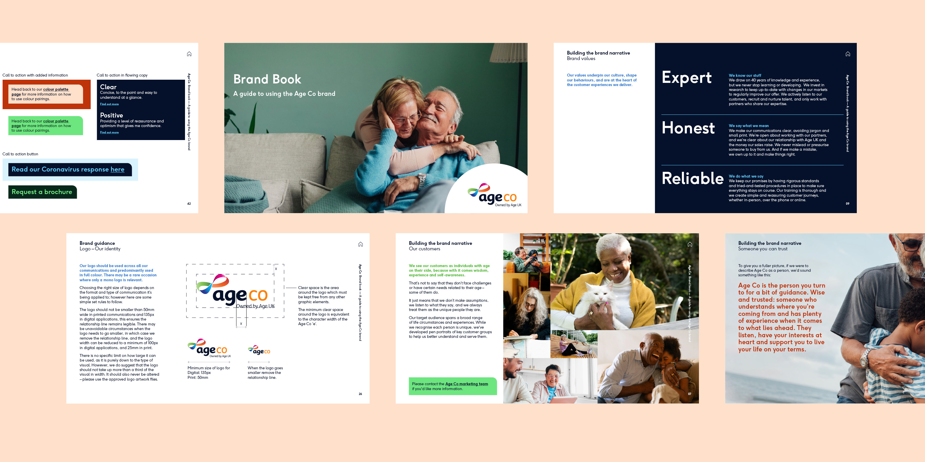
Our next task was to help this ‘age positive’ approach shine through the brand. We did this by building a new, clear narrative, tone of voice and personality to guide internal teams and stakeholders. This would help to deliver the distinctive ‘service excellence’ promised by Age Co consistently and coherently.
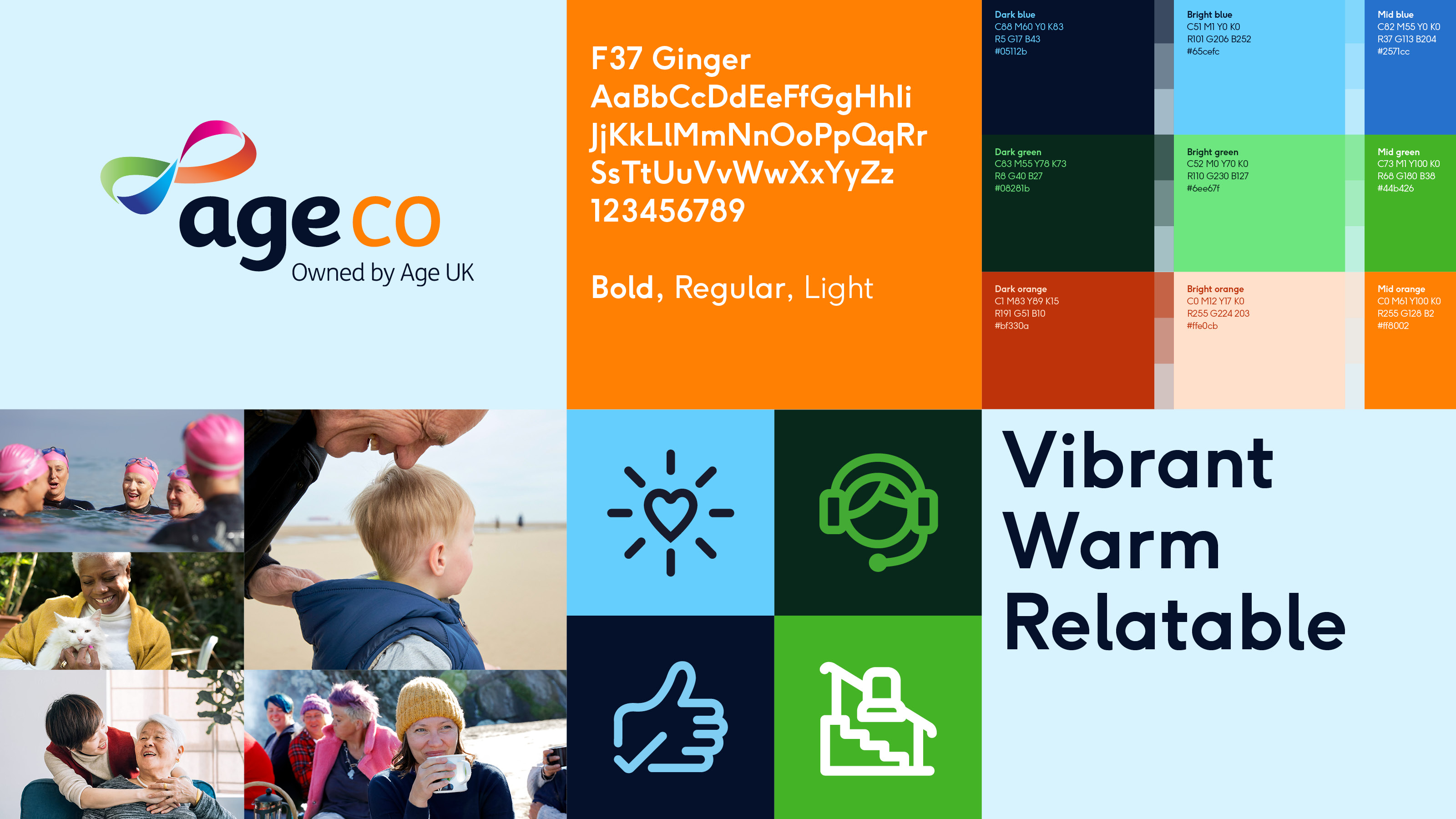
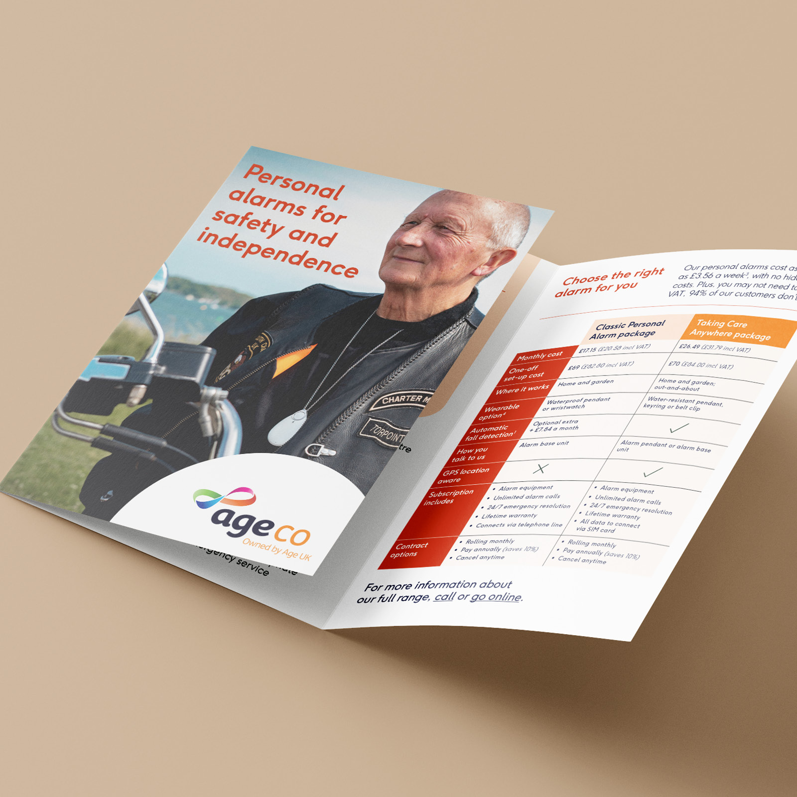
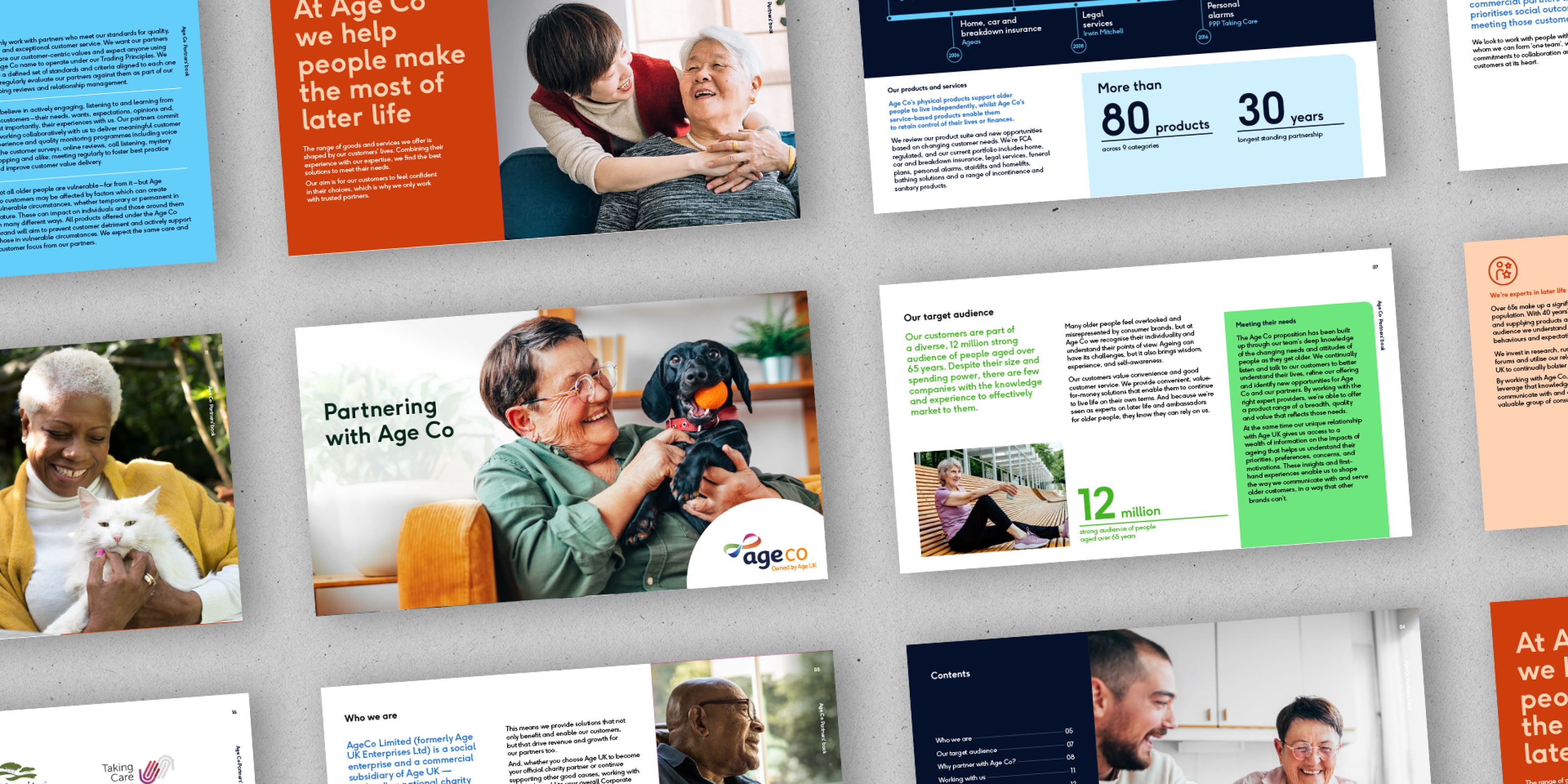
We also build a new VI for the brand that struck the right balance between diversity, needs and experiences, while still respecting the reality of the audience’s needs and experiences. Through imagery choice we created an expression with more appeal, warmth and stand out against the competition.
Finally, we addressed the issue of transparency, invigorating the logo mark with more distinction to help it stand apart from the Age UK parent brand, and providing new messaging that clarified the relationship between the two organisations.
The creative was rolled out in a three-part brand book that communicated the new brand story and values, guidelines including photographic style, typography, logo and an asset bank of messaging.